Project 1 - Using NYC Subway data to determine the best location to hand out event flyers
tl;dr In project 1, we learned the fundamental components of the Data Science “toolkit” by analyzing NYC MTA Subway data to recommend the optimal time/subway stop for a non-profit to have volunteers hand out event flyers.
Howdy! It’s been a few weeks since my last post, so I figured I would reflect on our first project at Metis. My hope is that this post will help you better understand the Metis experience, as well as learn some useful ways to deal with problems related to gathering, transforming, analyzing, and communicating data.
The problem
For project 1, we were tasked with helping a (fictional) non-profit determine the best times and subway locations in New York City to hand out flyers to subway riders in hopes of maximizing attendance at the non-profit’s summer gala.
Approach
For this project, we worked in teams of 3-4. I had the pleasure of working with David and Brian.
Here is the approach our team used to develop a recommendation for the non-profit. We iterated on this approach quite a few times before coming to our final recommendation.
- Understand the problem - we discussed the needs of the target audience, goals/objectives of our analysis, project assumptions, data sources, risks, etc.
- Gather, understand, clean, and transform the data - we downloaded the raw MTA data, reviewed the data field descriptions, plotted the raw data distributions, removed outliers, formatted the data properly (e.g., date fields), and aggregated the data so it was easier to analyze.
- Analyze the data and develop recommendations - we developed visualizations to help us better understand patterns in the data and develop an overall recommendation
- Present recommendations to the class
Recommendation
We recommended the non-profit do an initial “test” round with limited volunteers handing out flyers at the Union Square Subway Station on a Wednesday. The reasons we recommended they focus on Union Square were…
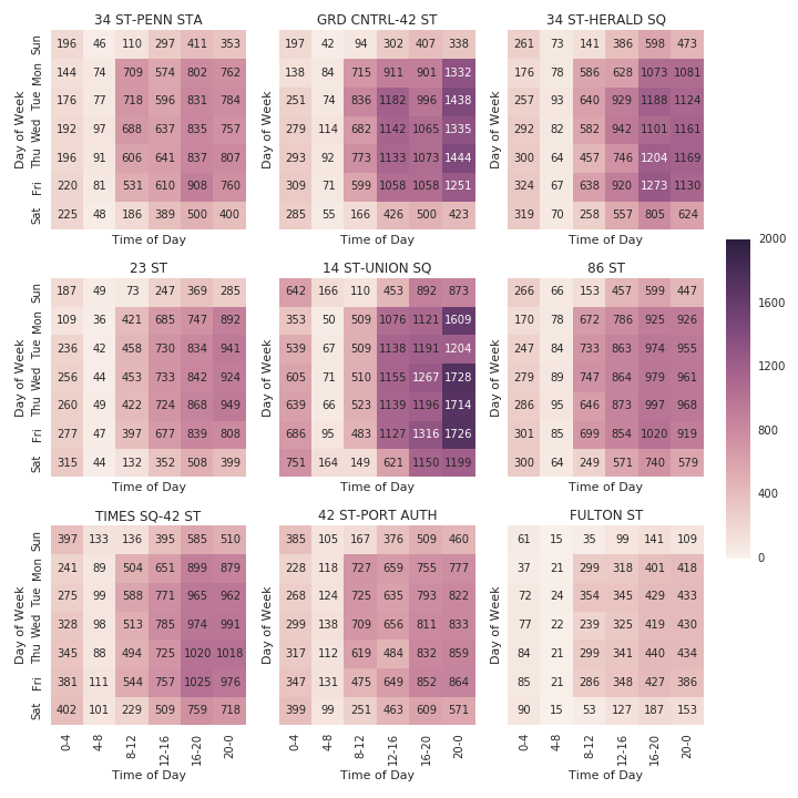
- Volume - Union Square was in the top 5 stations by total volume during the six-week time period we collected data. To get a sense for the volume of the top 9 stations by total volume, broken down by average total volume (entries + exits) check out the heatmap below which highlights the significant amount of traffic going through the Union Square station.
- More likely to fit target audience for the gala - other high-volume stations such as Penn Station and Grand Central have a higer amount of traffic from tourists and commuters coming from outside Manhattan. Those folks are less likely to be interested in attending the non-profit’s gala.
- Flexibility - Union Square has additional attractions close to the subway entrance so if there are any issues with standing around the subway entrances, volunteers can easily walk around the frequently crowded Union Square Park to hand out flyers instead. Union Square also attracts a good amount of traffic on the weekends in case the non-profit can only find volunteers on the weekends.
Average Station Traffic (Entries + Exits) for Top Nine Stations by Total Volume Based on MTA data from 2/21/2016 - 4/2/2016 {::nomarkdown}
 </img>
{:/}
The reason we recommended a “test” round is it would allow the non-profit to learn a significant amount of important information that was missing from our analysis (e.g., Is Union Square really a good place to hand out flyers? What entrance/exit to the station is best for volunteers to stand? Are there other groups competing for people’s attention? What types of people show the most interest?). If the “test” round is unsuccessful, the non-profit can change their focus to different subway stops without having wasted too much time. On the other hand, if the “test” round is successful, the non-profit can expand their flyer distribution with additional volunteers.
Key lessons learned
The following are the major things I learned during project 1.
- Work in small batches and iterate when working with large data sets - The six weeks of MTA data we looked at consisted of over one million rows. Loading and processing the data took a long time and at times froze up my computer if I wasn’t careful. The best way I found to address this was to work in small batches. For example, I worked on developing code to load only one row, then expanding that to ~100 rows, then to all rows. By working in smaller chunks, I was able to “fail quicker” and save time in the long run.
- Always test for bad data - There were a lot of issues with the MTA data that were not obvious at first glance. Some of the turnstiles recorded negative entries and exits. Some recorded unreasonably high entry and exit counts. Some stations shared the same name. One strategy that helped me deal with these issues was to test for outliers when processing the data and logging any abnormalities so I could investigate them further. Below is an example snippet of code where, as I convert the entry data from cumulative totals to counts, I print out rows that have negative entry counts, unusually high counts, or no counts at all.
Example of logging outliers when processing data
1
2
3
4
5
6
7
8
# log outliers (negative entry counts, unusually high counts, and no data)
try:
    if min(entry_counts) < 0:
        print '%s has negative values' % str(key)
    if max(entry_counts) > upper_bound_count:
        print '%s has unusually large values over %d' % (str(key),upper_bound_count)
except:
    print 'no data for %s' % str(key)
- Importance of understanding the data you’re analyzing Many folks in the class (myself included) did our initial data aggregation without realizing the MTA listed entry and exit numbers cumulatively. Once we realized the mistake, we had to back-track and refactor our code. In the future, I’ll be more careful to understand not only what each data field is, but also how it is calculated in its raw form.
- Overall familiarity with the Data Science “toolkit” What does the “toolbox” consist of? The key elements we were exposed to in project 1 were coding in Python, organizing and presenting our work in Jupyter/iPython notebooks, and using Git for version control. For Python coding, we focused heavily on working with built-in data types such as tuples, dictionaries, and lists. We used Pandas and Numpy for data processing/analysis and Matplotlib and Seaborn to visually present evidence to support our recommendation.
Key components of the Data Science “toolkit”

Project source
Interested in the nuts and bolts of the project? Check out the project source code on my github.